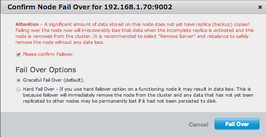
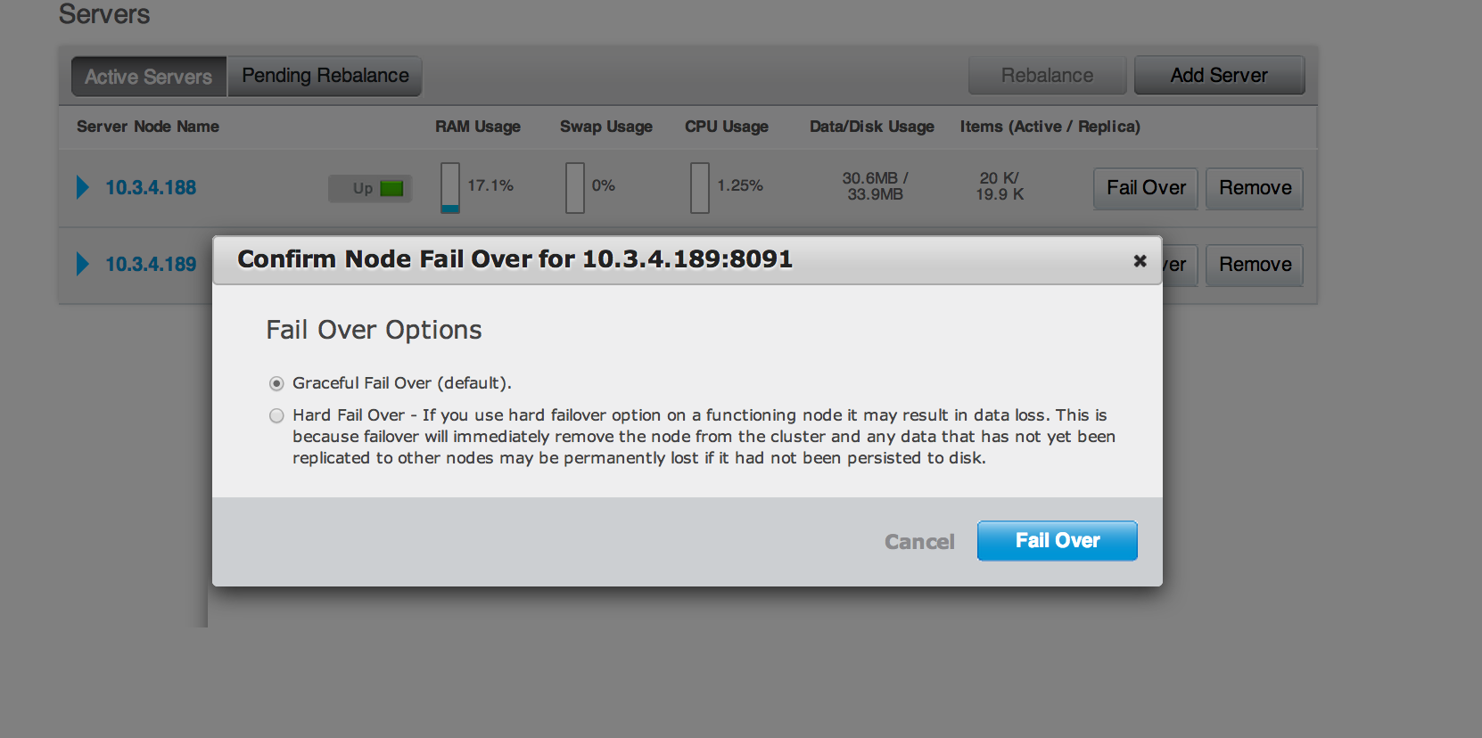
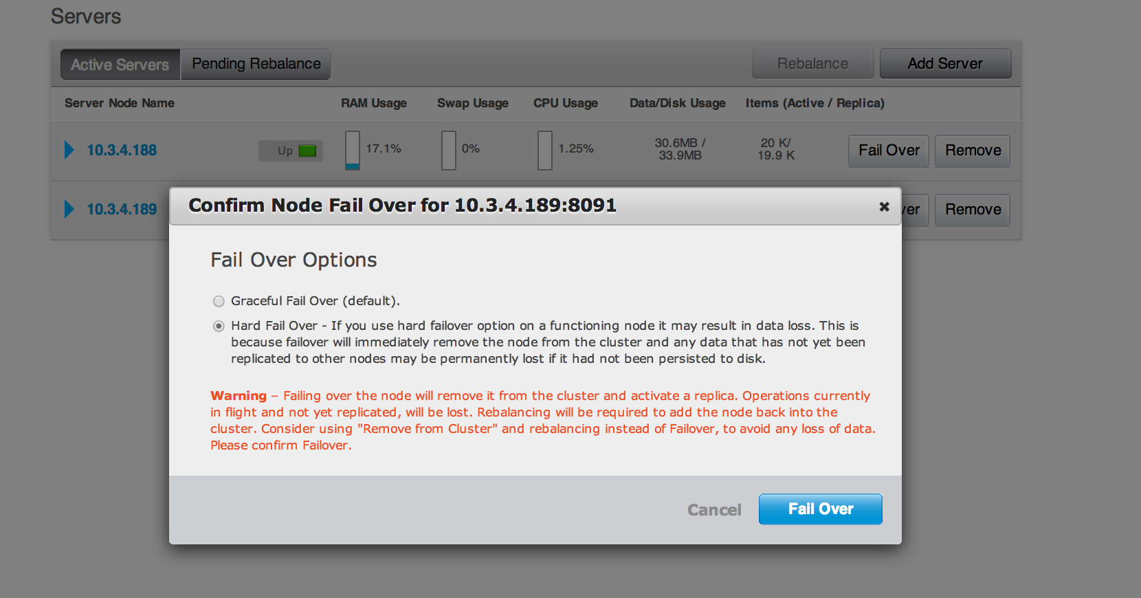
Description
Anil, can you pls see the attached screenshot of failover confirmation dialog?
I think it
1. is too verbose
2. can be designed better. Why have a checkbox and set of radio buttons?
3. is color-inconsistent - has one para in red, one in black. Doesn't look very nice.
If you agree can you pls assign it to ns_server?