Details
-
Improvement
-
Resolution: Fixed
-
 Major
Major
-
5.0.0
Description
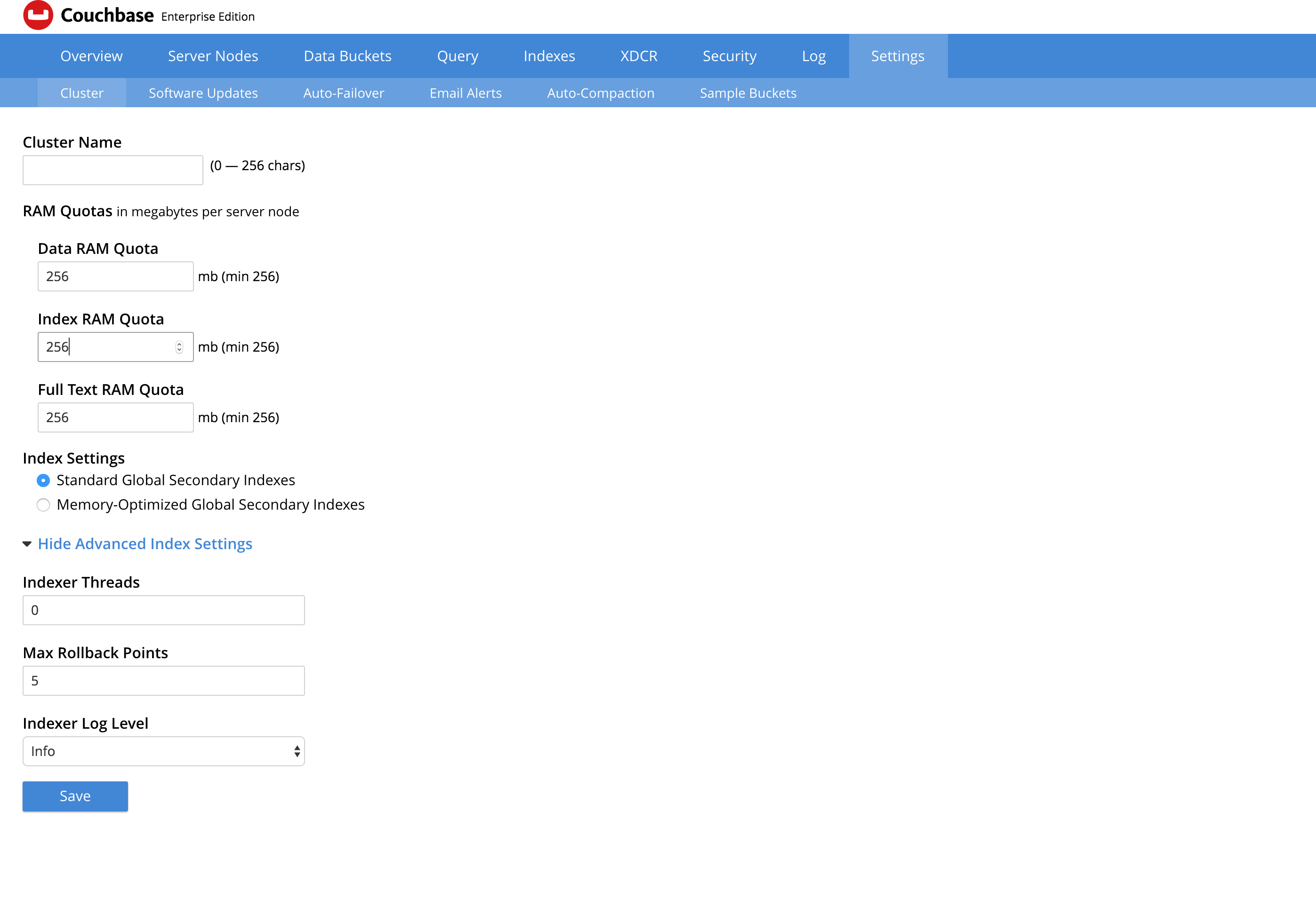
All the tabs in the Settings page look contain a lot of whitespace and don't use the while page well. Following changes might make it look better and with the same feel as other pages.
- Align all text boxes in Cluster settings page (and other pages too). While each sub-component of the page (like RAM quota) are aligned, aligning all the text boxes will have a better feel to the page.
- Better placing of the text and controls: Having the controls in the center of the page might give better look.
- Make the look and feel of the pages consistent with other pages in UI