Details
-
Improvement
-
Resolution: Won't Fix
-
 Minor
Minor
-
5.0.0
-
None
-
CBSS Sprint Dec-08-2017
Description
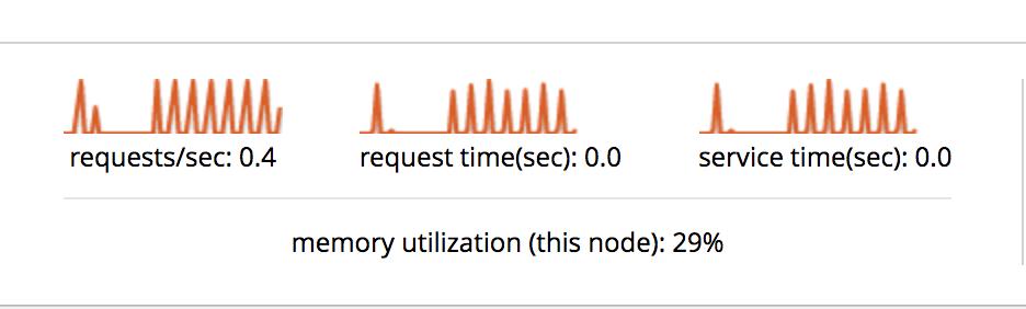
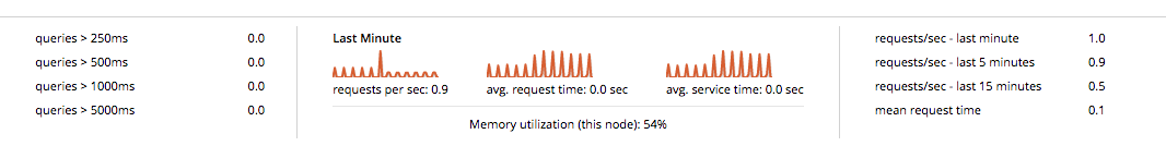
The query monitoring UI looks very neat, I spotted one small issue, the graphs at the bottom do not have a title for the x axis and as a result the user does not what time period is being represent.