Details
Description
The UI offers the ability to view graphs for stats across many different timeframes across the cluster.
To do this it seems to sum up the values across all of the nodes which you have selected.
Due to various circumstances, each node may not contain the same timeframe of statistics as each of the others.
Think of a situation, for example in a cloud deployment, where you could do a rolling swap rebalance upgrade by bringing up new instances.
This means that when the UI tries to aggregate these values, it provides misleading data.
I shall include screenshots below to demonstrate this in practice.
These are all from the same cluster where the total number of items has remained roughly the same for the past month:
*Cluster-wide view of items*

*View of the oldest node*

*View of the newest node*

*View of the other node*
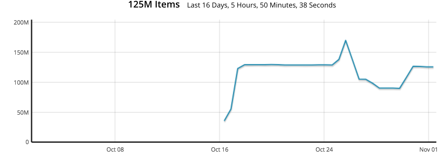
As you can see from the graphs, it looks like all of a sudden there was massive data growth in the cluster, whereas in fact this was caused by missing statistics from some of the nodes.
Without fully investigating and understanding this could cause problems for some users who are trying (rightly so) to monitor their metrics longer-term.
It would look less confusing if when we aggregated stats that we didn't show a value for datapoints where we have incomplete data (i.e. not all of the nodes have data from that timeframe).
Obviously this is not ideal as you won't be able to see longer term stats for clusters with fresh nodes in, but at least it doesn't provide false information.
Attachments


Issue Links
- relates to
-
MB-44762 Support the notion of "removing a node for maintenance"
-

- Open
-