Details
Description
Build - 7.0.1 - 5996
Steps
- Load covid dataset attached below.
- Run following analytics query.
SELECT * FROM covid limit 28
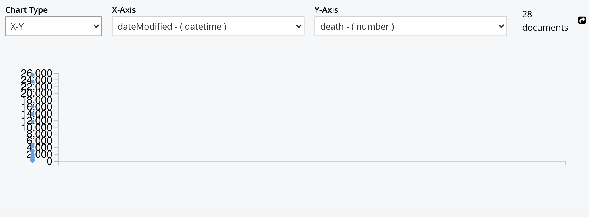
- Create 'dateChecked vs death' X-Y graph.
Issue
X-Y graph is displayed with no labels on x-axis and some points overlapping y-axis labels. PFA image for more info.