Details
-
Bug
-
Resolution: Unresolved
-
 Minor
Minor
-
7.1.0
-
None
-
Untriaged
-
1
-
No
Description
What's the issue?
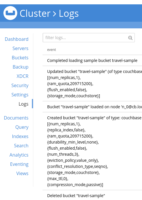
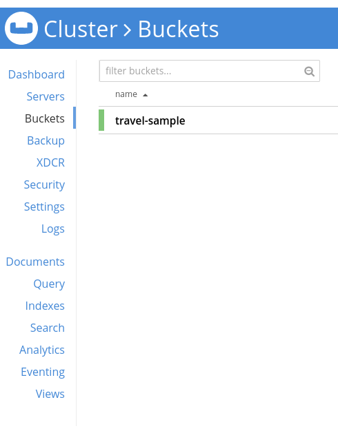
The UI currently has a "banner" across the top, depending on the page, this "banner" can have a smaller tabbed navigation bar beneath it (for example, when in "logs", it'll contain "logs" and "collect information").
Because we don't show this bar on every page, it affects the vertical height of the (left hand side) navigation bar (i.e. the one which includes "Dashboard"). This is jarring when navigating the UI and I could see this leading to unwanted miss-clicks (for example, for me, the "Buckets" button, moves down almost exactly to where "Backups" would usually be).
Possible fix?
Perhaps we could account for this height change, or even leave an empty navigation bar permanently (I think the contrast between the two shades of blue looks good). I'm not a UI designer, so I'm sure there's better solutions.